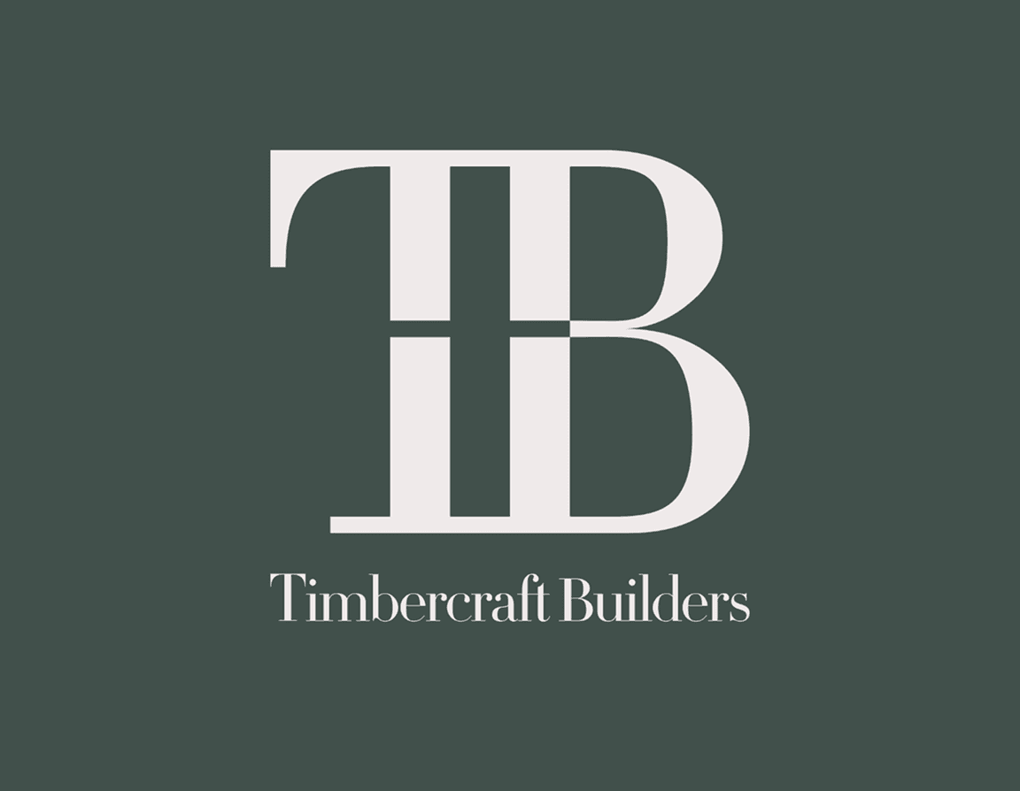
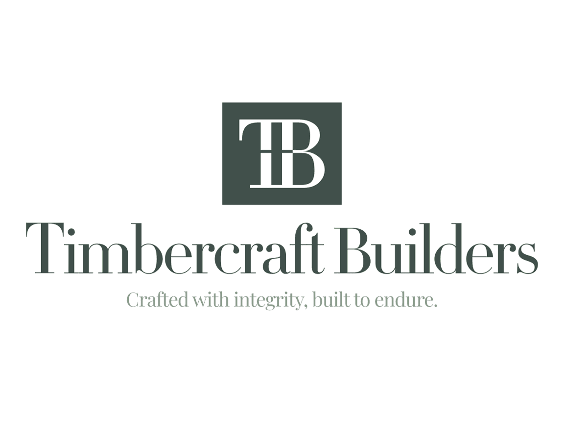
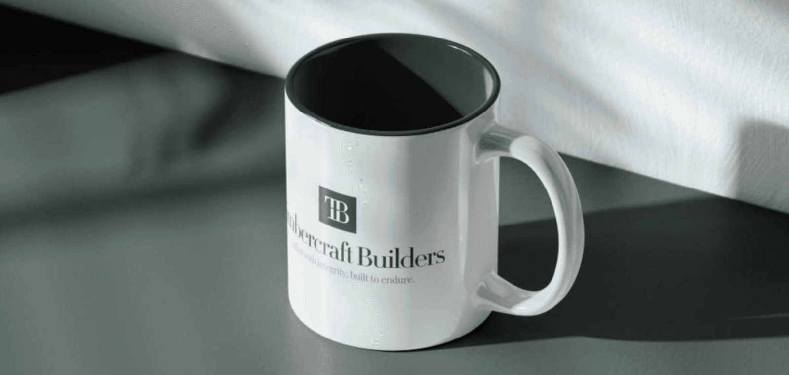
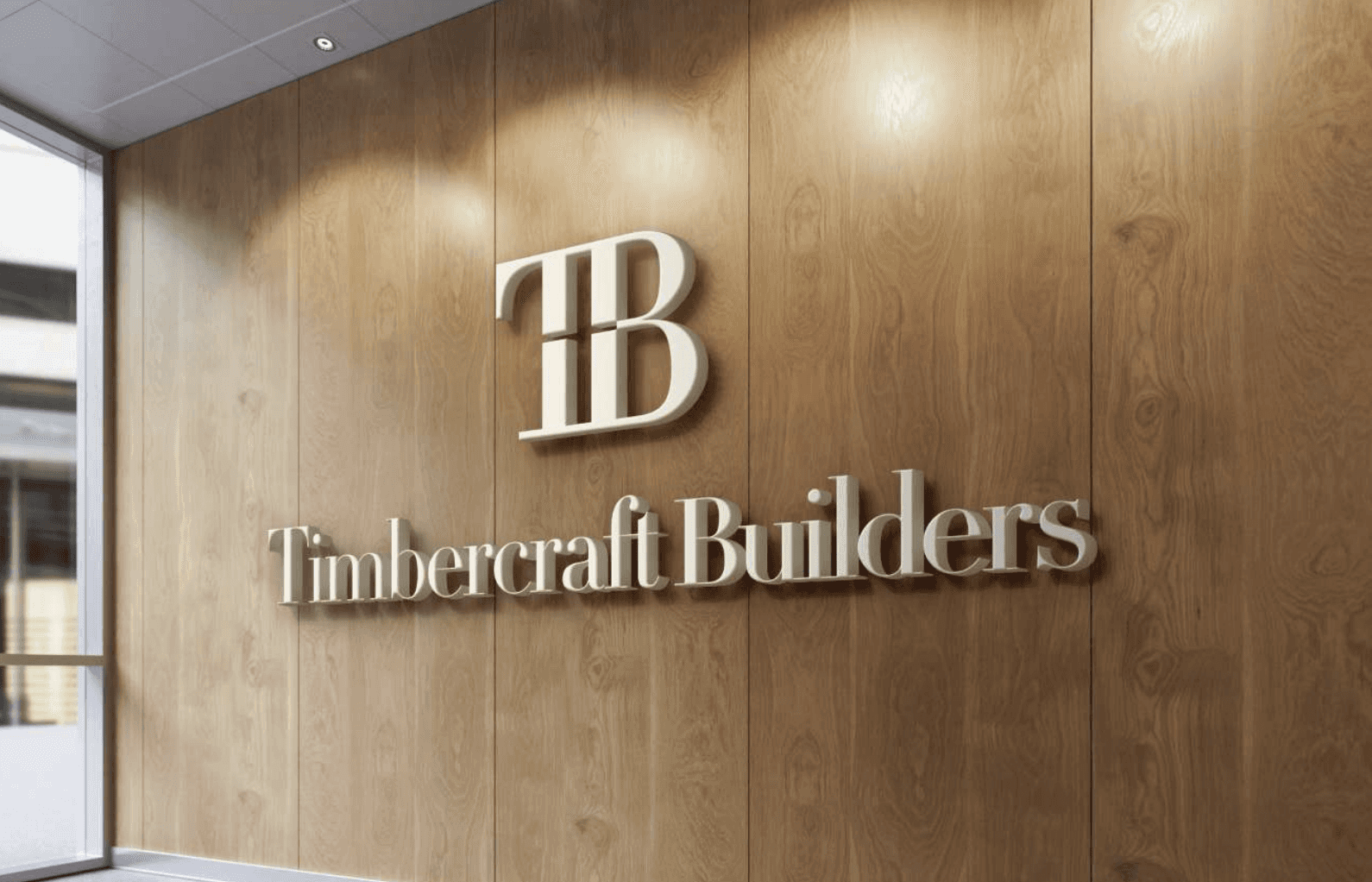
Timbercraft Builders Logo Design & Brand Guidelines

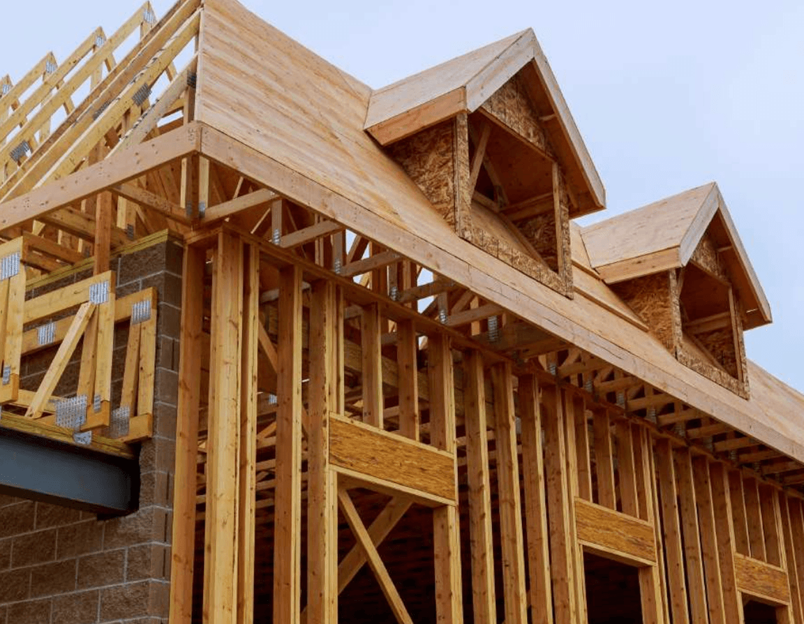
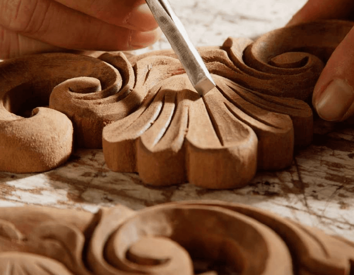
Craing high-quality homes and smaller developments with attention to

detail, blending durability with design.

CLIENT

Timbercraft Builders

Role

Brand designer

year

2025

Overview

Timbercraft Builders is a Texas-based homebuilding and land development company known for blending craftsmanship, durability, and design integrity. The project aimed to create a visual identity that reflects the warmth and reliability of a builder rooted in trust and precision.

Timbercraft Builders is a Texas-based homebuilding and land development company known for blending craftsmanship, durability, and design integrity. The project aimed to create a visual identity that reflects the warmth and reliability of a builder rooted in trust and precision.

Problem

The brand needed a professional yet human identity that connects its boutique craftsmanship with developer-scale expertise. The challenge was to create a logo system that evokes trust, warmth, and long-lasting value — standing apart from generic homebuilder visuals.

Key Insights

Brand emotions: Warmth, Craftsmanship, Reliability

  • Founder’s physics background informs technical precision

  • The identity must balance approachability and professionalism

  • Competitors: Hines, Trammell Crow, and boutique residential developers

Brand emotions: Warmth, Craftsmanship, Reliability

  • Founder’s physics background informs technical precision

  • The identity must balance approachability and professionalism

  • Competitors: Hines, Trammell Crow, and boutique residential developers

Concept & Story

The logo draws from structural blueprints — beams, columns, and foundations — symbolizing both engineering integrity and human craftsmanship.
It merges T + B into a unified form built around the idea of structure, section, and scaffolding — embodying “Crafted with integrity, built to endure.”

The logo draws from structural blueprints — beams, columns, and foundations — symbolizing both engineering integrity and human craftsmanship.
It merges T + B into a unified form built around the idea of structure, section, and scaffolding — embodying “Crafted with integrity, built to endure.”

Solution

A refined logo system featuring both horizontal and vertical layouts. The identity uses architectural geometry, soft earth tones, and modern typography to balance reliability with warmth.

A refined logo system featuring both horizontal and vertical layouts. The identity uses architectural geometry, soft earth tones, and modern typography to balance reliability with warmth.

View Full Case Study

© 2026 Rahul Saxena. All rights reserved.

© 2025 Rahul Saxena. All rights reserved.

Create a free website with Framer, the website builder loved by startups, designers and agencies.